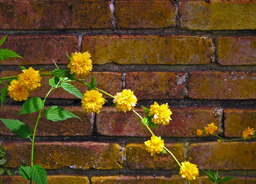
A number of people have asked how I achieve my effects with textures, so I thought I'd do a little tutorial. It's pretty much the same way as everyone else does them, but it's always interesting how everyone's comes out differently, depending on their style. Here's the original picture, of some Mother's Day flowers I got:
It's an okay picture, but I knew I could make it better. The first thing I do is clone out any areas of color or brightness that I think will detract from the final image. In this case, I cloned out the small pink area on the right, and the white lines in the lower right corner; I also cloned out the bud at the top that was going across the iris petal. The cloning doesn't have to be perfect, because the texturing will cover it.
Next I crop, and in this case, I cropped out some of the areas I'd cloned, so I could have saved myself the trouble :) (Just thought I'd share my little slip-up, in the interest of full disclosure.)
I liked it better pulled in a little closer to the flowers. Next, I choose my first texture. I want to minimize the bright area on the lower left, so I chose a Flypaper Texture called "Tempest Sea," from their Spring Painterly set. As you can see, it's darker on the bottom, particularly in the left corner:
I float the texture in its own window, and then use the move tool to slide it over the photo, and use the grabbers to resize it. (In Photoshop, make sure the "Show transform controls" box is checked at the top of the move tool bar). Once the texture is on its layer over the photo, I click the check mark at the top and then find the blend mode I like -- in this case, I like Hard Light at 74%. At this point, the flowers don't look great, but that's okay because I'm only looking at the background, and I like the way the bright spot on the lower left is toned down.

Next, I use a layer mask and the brush tool to brush most of the texture off the main subject. In Photoshop, you create a layer mask by clicking the little square with a circle in it at the bottom of the Layers panel, and then with the mask square selected, I used a soft brush and a setting of about 80% to take the texture off the orange flowers, and a setting of about 48% to take the texture off the blue background flowers. Make sure that black is selected as the foreground color -- black adds the mask, white takes it off (if you make a mistake in the brushing part, just switch to white and you can take it off). You can see what you're doing more easily by hitting "\", which will show you the mask in orange, as you can see here:
Now I choose my next texture -- "Spring Equinox," again from Flypaper's Spring Painterly set -- I like this one because it will green up the background more, and begin to darken the edges a bit. Here's the texture, followed by the effect.
The blend mode I used was Overlay, at 100%, and I again used the brush and a layer mask to brush away the texture on the flowers, but not so much this time because I liked the way the texture brightened the flowers. I decided I wanted to see if I could darken the background even further -- I'm liking the way the orange flowers are really beginning to come forward -- so I chose "Cyprus Haze," from the Tex Box Two set at Flypaper; it's a really dark green, again with darker edges.
I used Overlay at 84% here, and brushed away maybe 70% of the texture, with this result:
I'm happy with the picture now, but I wanted to try one more thing. I duplicated the original (bottom) layer, leaving it right above the bottom layer, changed the Image mode to 8 bits (I don't know if you have to do this in every version, but you do in CS5), and then go to "Filters - Artistic - Paint Daubs." I like the effect that this filter gives -- this is the brush type "Sparkle," with the brush size at 10 and the sharpness at 11.
I really like the final effect, so I'm done. As a last bit of housekeeping, I do the following: 1) change the names of the layers to the names of the textures, so I know which ones I used; 2) save as a PSD file, which maintains the layers (so I can go back and work with it more, if I want to); 3) Go "Layer - Flatten Image," and save that for web and devices at around 600 pixels on the long side. (If I'm not using it in the blog, I'll save as a regular .jpg.) And I'm done! Here's the final product:
What do you think? I hope I've explained things well -- if I haven't, just ask and I'll answer. And please sign up for the giveaway! You could win this picture, if you like it!


 Posted by


 c
c